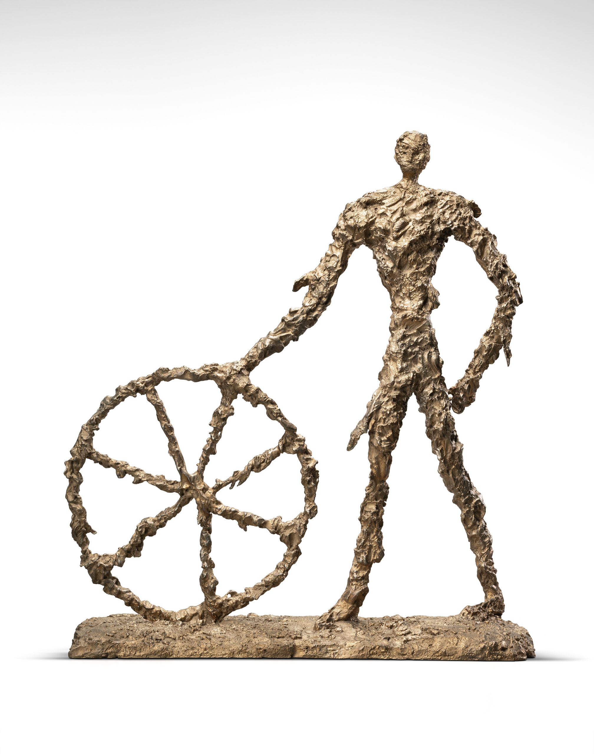
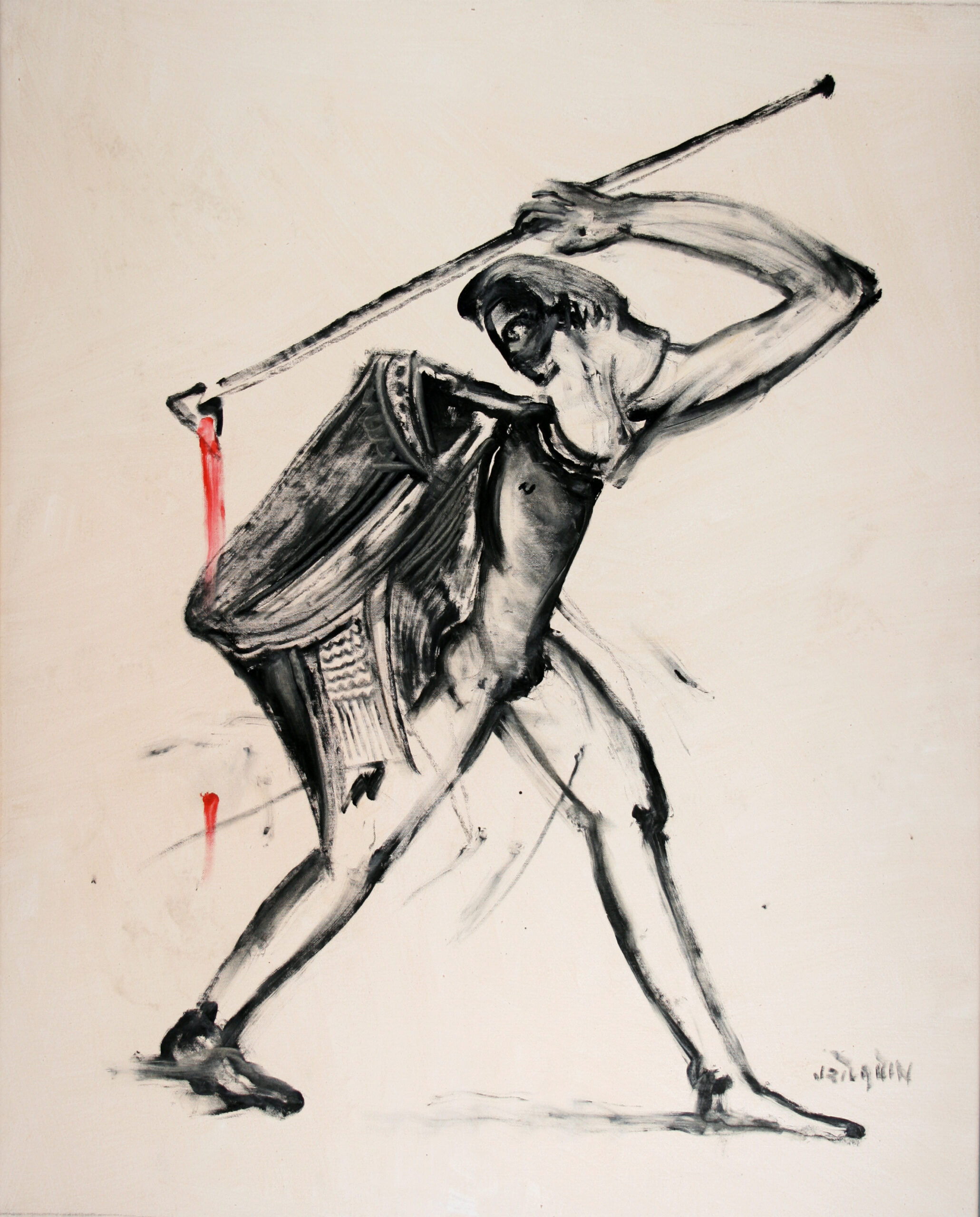
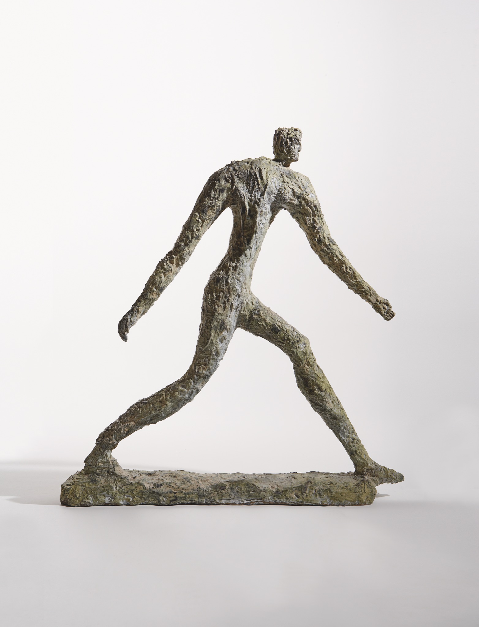
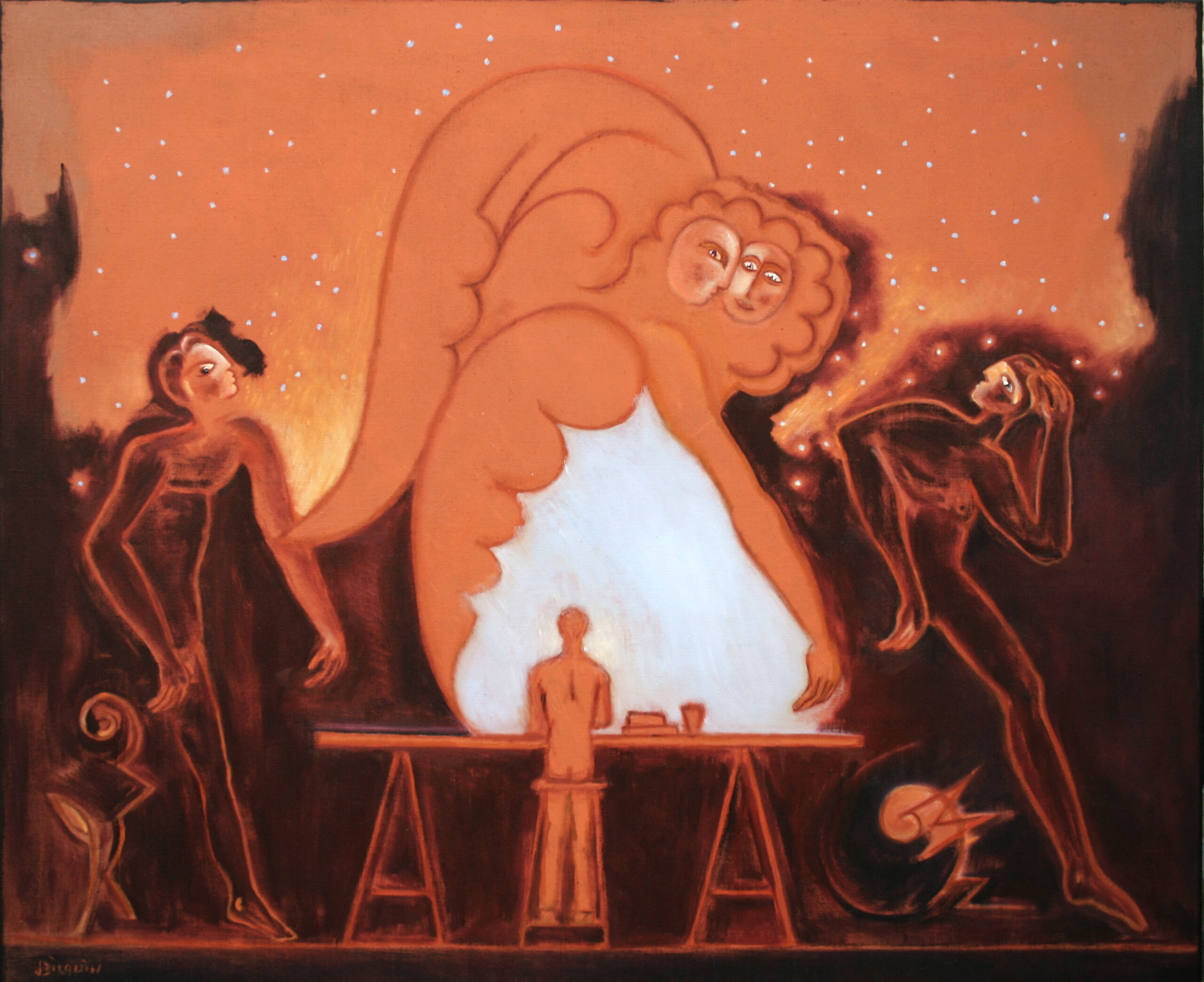
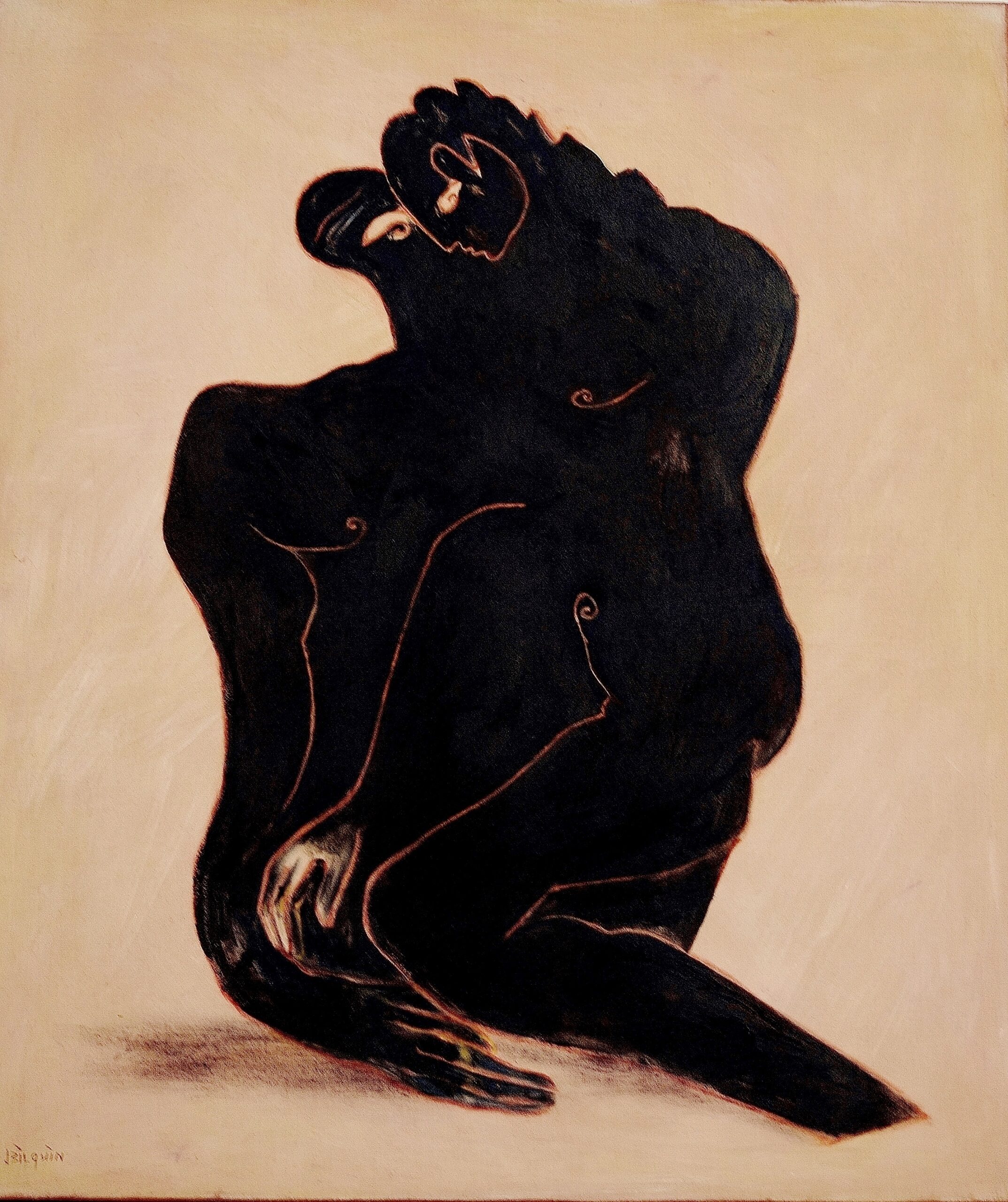
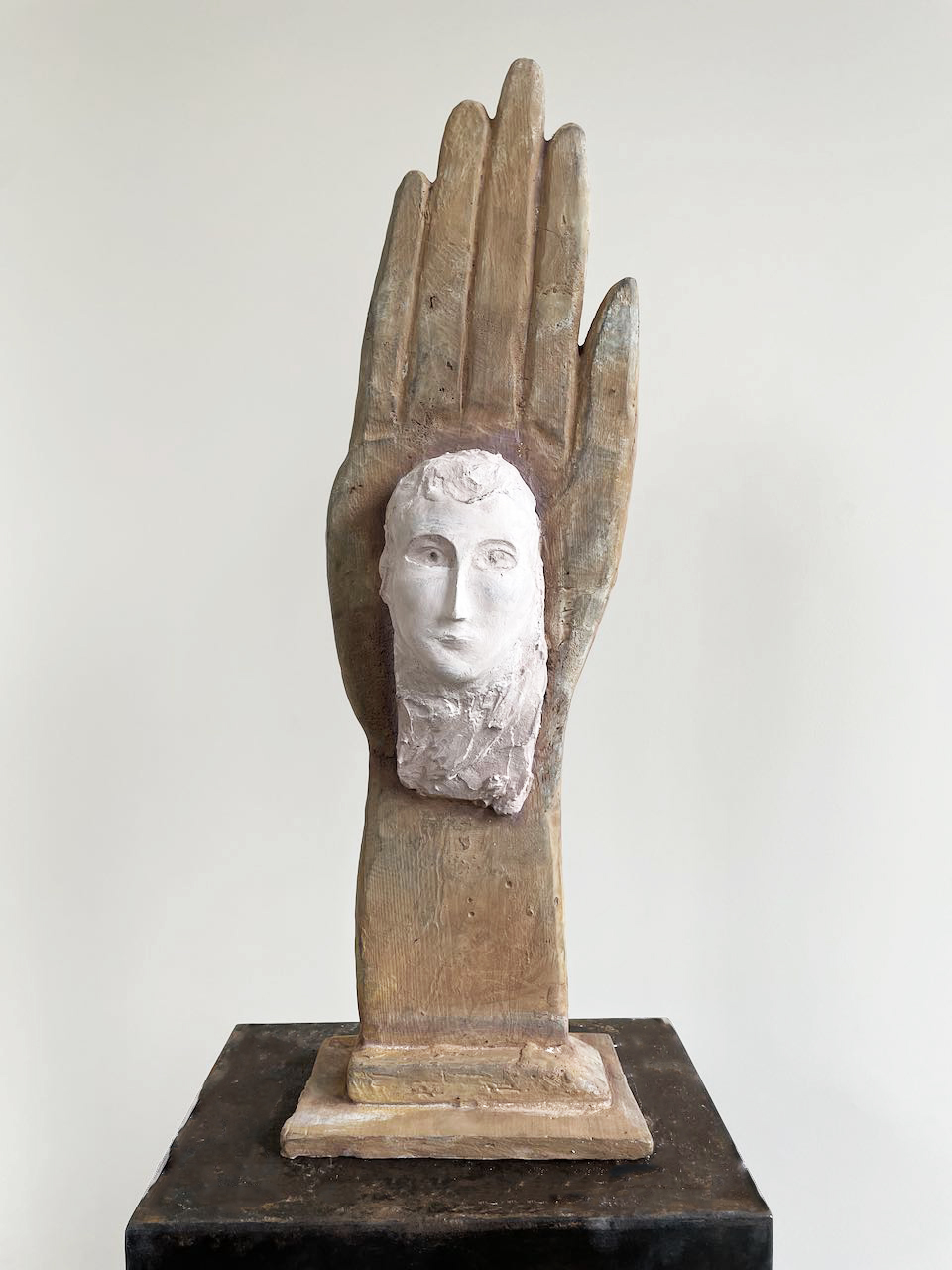
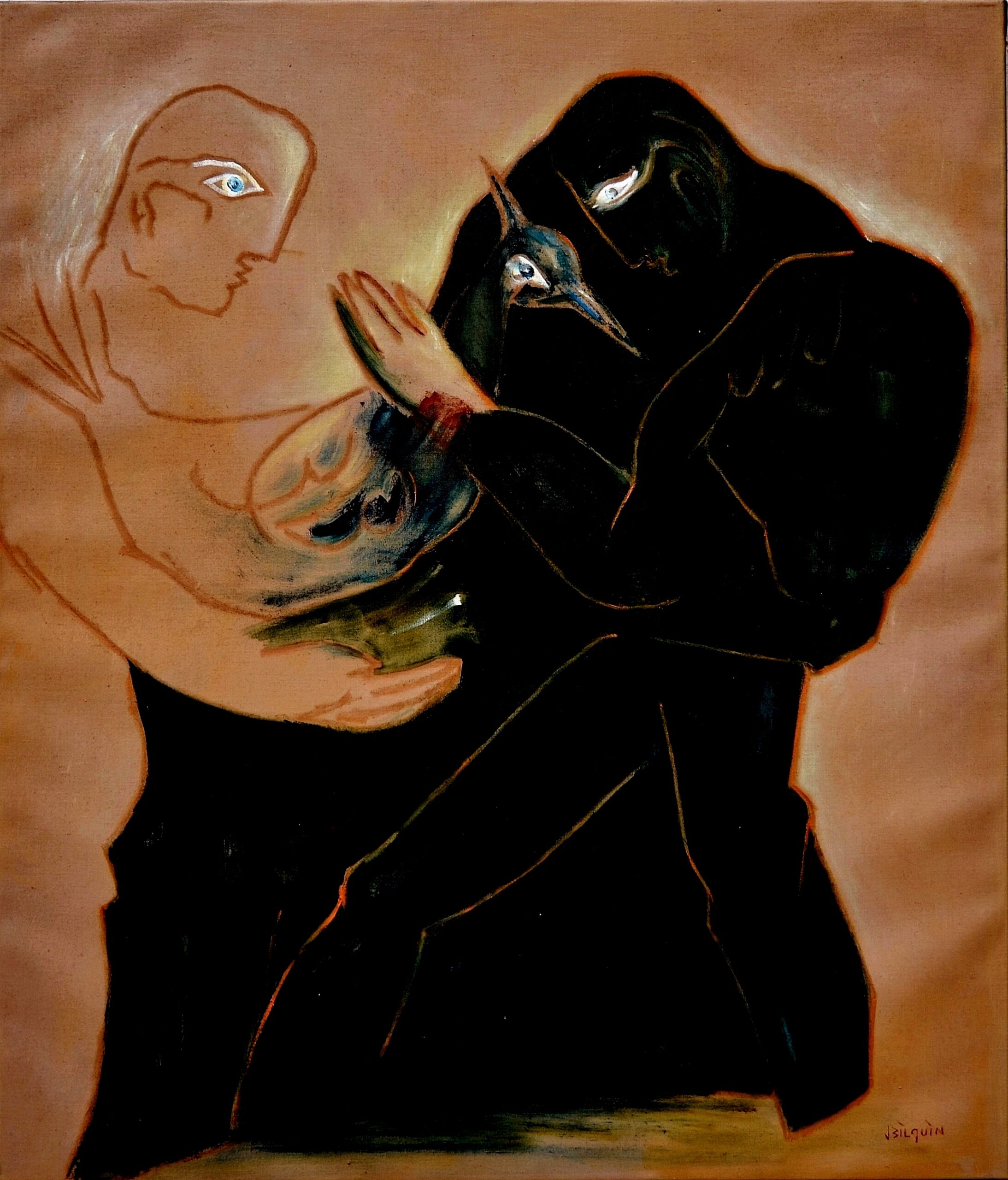
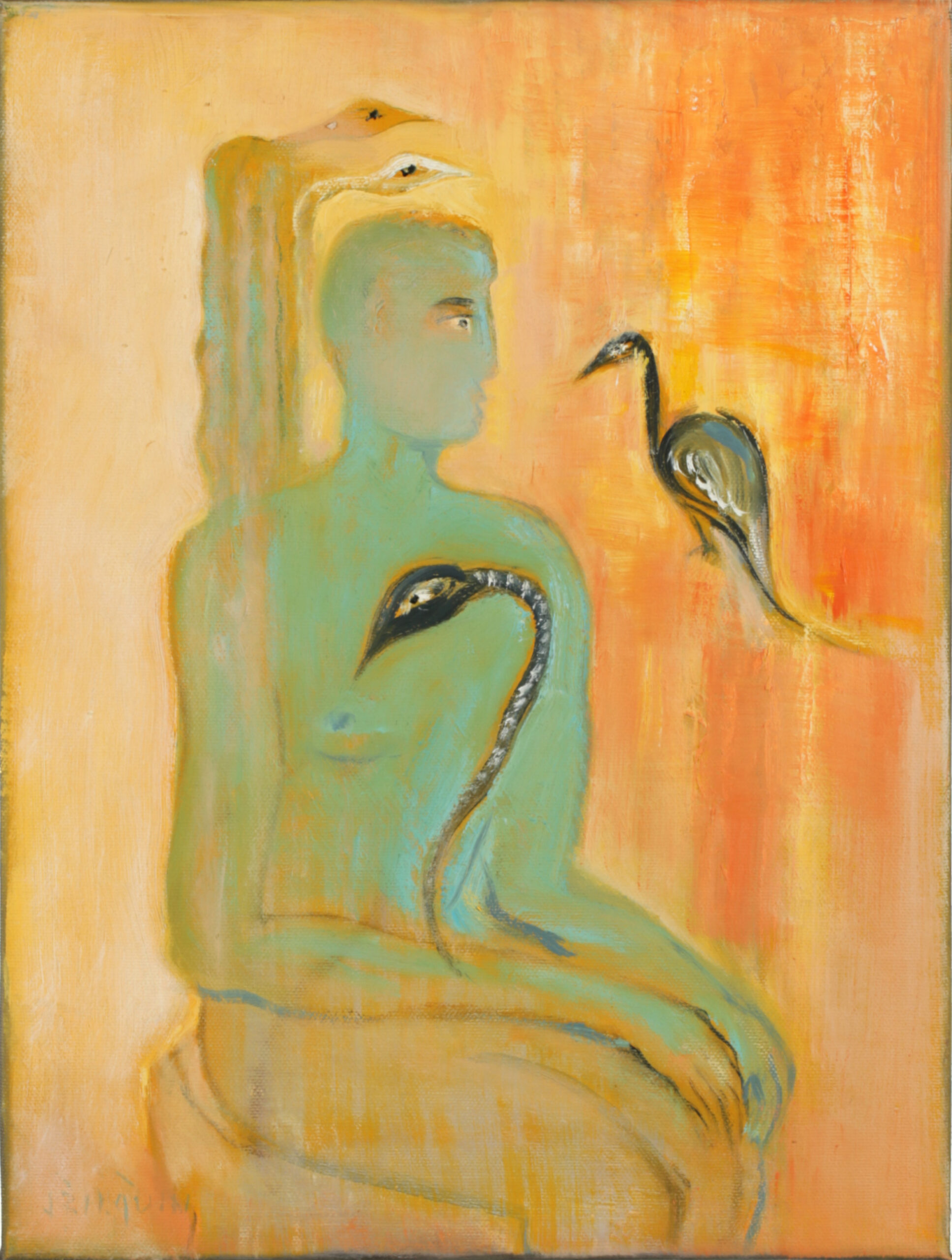
De mens, tussen Materie en Chaos
15.03 - 01.06.2024
Campo & Campo, Antwerpen- Berchem
Tentoongestelde werken
#jtg-4788 .modula-item .jtg-social a, .lightbox-socials.jtg-social a{ fill: #ffffff; color: #ffffff }#jtg-4788 .modula-item .jtg-social-expandable a, #jtg-4788 .modula-item .jtg-social-expandable-icons a{ fill: #ffffff; color: #ffffff }#jtg-4788 .modula-item .jtg-social svg, .lightbox-socials.jtg-social svg { height: 16px; width: 16px }#jtg-4788 .modula-item .jtg-social-expandable svg { height: 16px; width: 16px }#jtg-4788 .modula-item .jtg-social-expandable-icons svg { height: 16px; width: 16px }#jtg-4788 .modula-item .jtg-social a:not(:last-child), .lightbox-socials.jtg-social a:not(:last-child) { margin-right: 10px }#jtg-4788 .modula-item .jtg-social-expandable-icons { gap: 10px }#jtg-4788 .modula-item .figc {color:#ffffff;}#jtg-4788 .modula-item .figc .jtg-title { font-size: 24px; }#jtg-4788 .modula-item .modula-item-content { transform: scale(1); }#jtg-4788 { width:100%;}#jtg-4788 .modula-items .figc p.description,#jtg-4788 .modula-items .figc .jtg-description { font-size:16px; }#jtg-4788 .modula-items .figc p.description,#jtg-4788 .modula-items .figc .jtg-description { color:#ffffff;}#jtg-4788 .modula-items .figc .jtg-title { color:#ffffff; }#jtg-4788.modula-gallery .modula-item > a, #jtg-4788.modula-gallery .modula-item a.modula-item-link, #jtg-4788.modula-gallery .modula-item-content > a:not(.modula-no-follow) { cursor:zoom-in; } #jtg-4788.modula-gallery .modula-item-content .modula-no-follow { cursor: default; } @media screen and (max-width:480px){#jtg-4788 .modula-item .figc .jtg-title { font-size: 12px; }#jtg-4788 .modula-items .figc p.description,#jtg-4788 .modula-items .figc .jtg-description { color:#ffffff;font-size:10px; }}
Foto’s van de tentoonstelling
#jtg-4822 .modula-item .jtg-social a, .lightbox-socials.jtg-social a{ fill: #ffffff; color: #ffffff }#jtg-4822 .modula-item .jtg-social-expandable a, #jtg-4822 .modula-item .jtg-social-expandable-icons a{ fill: #ffffff; color: #ffffff }#jtg-4822 .modula-item .jtg-social svg, .lightbox-socials.jtg-social svg { height: 16px; width: 16px }#jtg-4822 .modula-item .jtg-social-expandable svg { height: 16px; width: 16px }#jtg-4822 .modula-item .jtg-social-expandable-icons svg { height: 16px; width: 16px }#jtg-4822 .modula-item .jtg-social a:not(:last-child), .lightbox-socials.jtg-social a:not(:last-child) { margin-right: 10px }#jtg-4822 .modula-item .jtg-social-expandable-icons { gap: 10px }#jtg-4822 .modula-item .figc {color:#ffffff;}#jtg-4822 .modula-item .figc .jtg-title { font-size: 24px; }#jtg-4822 .modula-item .modula-item-content { transform: scale(1); }#jtg-4822 { width:100%;}#jtg-4822 .modula-items .figc p.description,#jtg-4822 .modula-items .figc .jtg-description { font-size:16px; }#jtg-4822 .modula-items .figc p.description,#jtg-4822 .modula-items .figc .jtg-description { color:#ffffff;}#jtg-4822 .modula-items .figc .jtg-title { color:#ffffff; }#jtg-4822.modula-gallery .modula-item > a, #jtg-4822.modula-gallery .modula-item a.modula-item-link, #jtg-4822.modula-gallery .modula-item-content > a:not(.modula-no-follow) { cursor:zoom-in; } #jtg-4822.modula-gallery .modula-item-content .modula-no-follow { cursor: default; } #jtg-4822.modula-gallery .modula-item, #jtg-4822.modula-gallery .modula-grid-sizer { width: calc(50% - 5px) ; } @media (min-width: 768px) and (max-width:992px) { html body #jtg-4822.modula-gallery .modula-item, html body #jtg-4822.modula-gallery .modula-grid-sizer {width: calc(50% - 5px ) ; } }@media (max-width: 768px) { html body #jtg-4822.modula-gallery .modula-item, html body #jtg-4822.modula-gallery .modula-grid-sizer {width: calc(50% - 5px ) ; } }#jtg-4822 .modula-items{position:relative;}@media screen and (max-width:480px){#jtg-4822 .modula-item .figc .jtg-title { font-size: 12px; }#jtg-4822 .modula-items .figc p.description,#jtg-4822 .modula-items .figc .jtg-description { color:#ffffff;font-size:10px; }}


